


Background
As a UX Designer living in Barcelona, I noticed friends and family struggling with the Sagrada Familia's website when trying to purchase tickets. Motivated by their feedback and Google reviews, I decided to redesign the landing page to improve the overall user experience.
The Challenge
Streamline user navigation on the landing page and simplify access to information.
The Outcome
A redesigned landing page offering improved navigation and clearer information layout, resulting in higher user satisfaction and increased online engagement.
Research and early Testing
Approaching the Problem
The initial phase focused on understanding the existing issues in the navigation of the landing page and its sections.
Main Issues:
Confusing layout and information presentation.
Difficulty accessing crucial details like opening times and directions.
Lack of straightforward navigation.
Misleading placement of the donation button next to the ticket purchase button.
After identifying multiple issues on the existing landing page, I sketched a low-fidelity wireframe, which I later refined into a mid-fidelity wireframe to perform usability testing on.

Living close to the Sagrada Familia allowed me to conduct in person research. I carried out guerrilla usability testing on the mid-fidelity wireframe with four participants recruited outside the cathedral, leveraging their familiarity with the current website for insightful feedback. When prompted to share their experiences with the current website they recalled two issues.
Insights:
Users easily located the ticket purchasing button.
Information was presented in a precise and digestible format.
Immediate access to opening hours was essential.
The isolated call-to-action button reduced confusion.
Emerging Issues:
Difficulty reading some information in the news section due to animation movement.
Difficulty to find information about the app, essential for audioguides when visiting.

Click to expand
ideation and iteration
Synthesizing the Data and Iterating on the Prototype
Based on user feedback, I made some key changes and brought the design to high fidelity quality.
Added clear indicators to the hero section for opening hours and location.
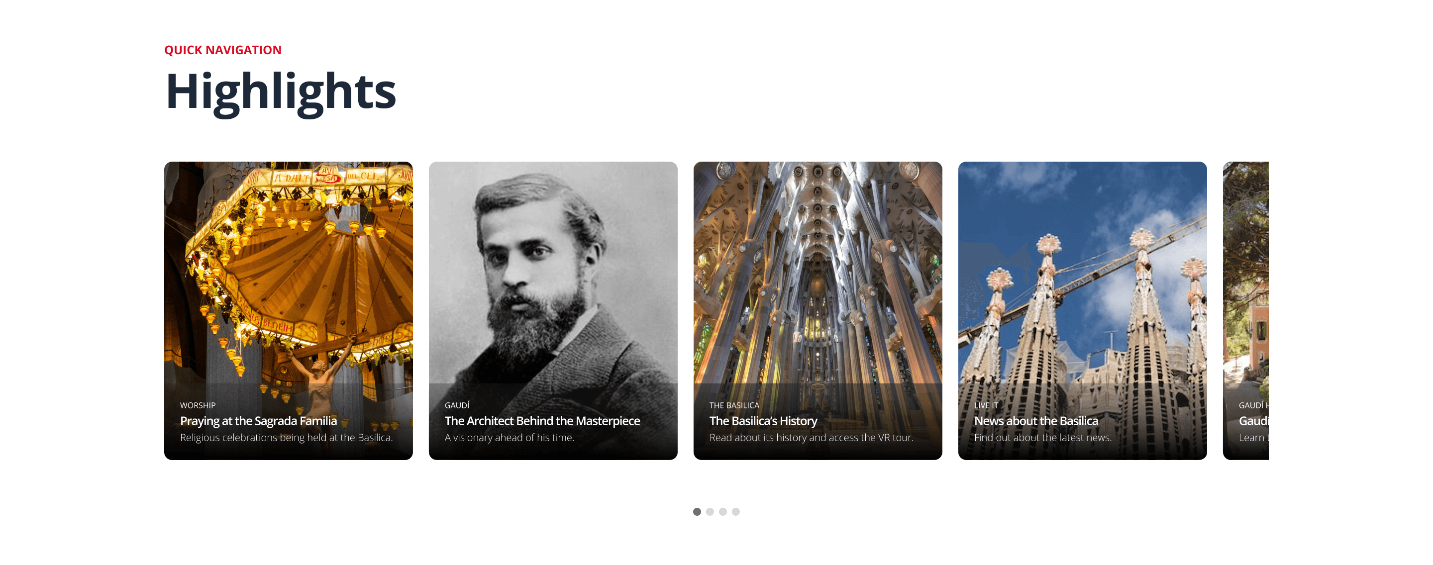
Introduced a new highlights section with more visually appealing and easily digestible information.
Improved the news section to display the latest three articles, allowing users to read at their own pace without feeling overwhelmed.


Addressing Specific Issues:
Relocated the donation button to the footer to reduce mis-clicks, while adding social proof to enhance trust.
Moved essential app information to the footer for quick access, streamlining user interaction.

These iterative improvements brought the design to a point where I was satisfied with its user-friendly features and visually appealing interface.
Validating the design
Testing the New Prototype and Validating
Current Design
Proposed Redesign
Retrieve location and opening time information
Easily locate and distinguish the purchase ticket button
Locate and identify the donations section
Easily locate the buttons to get the mobile app
To validate the solution, I conducted usability tests with six new users familiar with the Sagrada Familia website. They performed four tasks on both the current and redesigned sites, offering relevant feedback.
SIDENOTE:
Five users found the wording “Give a Boost” confusing in the donation section of the current website, while three others expressed satisfaction with the information shown in the redesigned footer about donations.
Conclusion
Final Thoughts
The new design is more user-friendly, modern, and visually appealing, which were the initial goals I set for this challenge.
The initial research was key to understanding usability issues and guiding the design process. After wrapping up the redesign, I'm satisfied with the results and changes achieved, although there's always room for improvement.
In the future, I'm excited about redesigning the entire website and mobile app to create a more unified and comprehensive user experience.
Overall, I'm pleased with how the project turned out. The best part is seeing the positive impact on user experience. I look forward to future improvements on this project.
Thanks for reading - feedback is welcome
NOTE: This is a personal project. I do not work for, nor am I affiliated with the Sagrada Familia in any way.