
Gold Trading, Reimagined: Boosting Trust Through UX Design
Role
Duration
Tools


TL;DR Goldealers Redesign
I redesigned Goldealers’ platform—a UK-based precious metals marketplace—to mirror the trust of their in-store service digitally. By simplifying valuation and onboarding flows, the new experience turns the anxiety of selling gold into confidence, with clear, frictionless design that reinforces the brand’s premium credibility.
Project overview
About
Goldealers is a family-run UK business specializing in precious metals since 2006. Known for secure transactions, honest staff, and transparent pricing, the in-store experience had earned them deep customer trust. But their website failed to reflect this—leaving online visitors skeptical, especially first-time sellers facing an unfamiliar, high-stakes process.
Problem Statement
The website was not meeting the expectations of first-time sellers or returning users. It lacked emotional cues, a clear and reassuring tone, and visible trust elements. Key interactions, like creating an estimate, were locked behind mandatory account creation, which further discouraged exploration. As a result, users did not feel confident proceeding with such high-stakes transactions through the platform.
Project Goals and Objectives
The redesign aimed to create a digital experience that matched the professionalism of the in-store experience while introducing valuable, user-centered features. The primary objectives included:
Building trust through clear content, testimonials, and visual cues.
Removing friction for new users.
Turning account creation into a helpful next step—not a roadblock
Making the process visual and easy to follow.
Encouraging long-term engagement through tools like saved estimates and price alerts.
Team Composition and Timeline
This was a 15-day solo design sprint. I worked directly with the founder, who acted as product owner and provided insights from years of experience with customers and operations. We used Slack for daily communication and held a few meetings to align on progress, goals, and specific project details.
Research
Approach
To move fast while staying grounded, I combined stakeholder interviews, a heuristic audit of the existing website, and competitor analysis. I also gathered informal insights from customer support chats, user reviews, and in-store staff.
What I learned
An interview with the physical store staff revealed that trust is the key barrier for online transactions. Users often prefer in-store visits due to fear of postal loss or fraud. However, if trust and transparency are clear online, many would switch to postal service. This insight drove me to focus on safety reassurances, pricing clarity, and showcasing customer service strengths digitally.
Competitor Landscape
Most competitors emphasized urgency (“Sell now!”) but failed to emotionally reassure users. Many hid core processes behind logins and skipped over what happens after a quote is submitted. This opened an opportunity for Goldealers to differentiate through transparency, calm tone, and educational content.
Key Findings and Insights
Trust is fragile online—especially when valuables are involved.
Users wanted clarity before commitment.
Uncertainty around the process caused major drop-offs.
Social proof (testimonials, badges, secure payment logos) made a noticeable impact.
Repeat users wanted tools to track prices and return when the time felt right.
DESIGN PROCESS
User Personas and Journey Maps
I created five personas based on behavioral patterns and emotional needs:
Hesitant First-Time Seller
Occasional Seller
Investor
Ethical Buyer
Traditionalist
Their journeys revealed common drop-off points—unclear language, forced sign-ups, and lack of trust signals. These directly informed layout, copy tone, and the timing of reassurance and guidance throughout the flow.


Design Execution
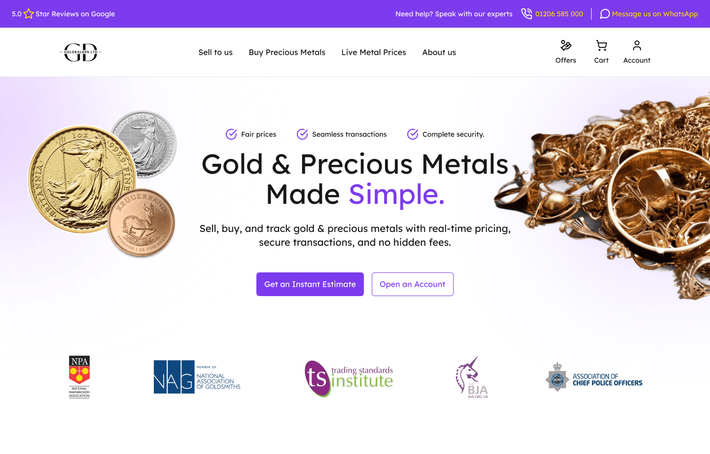
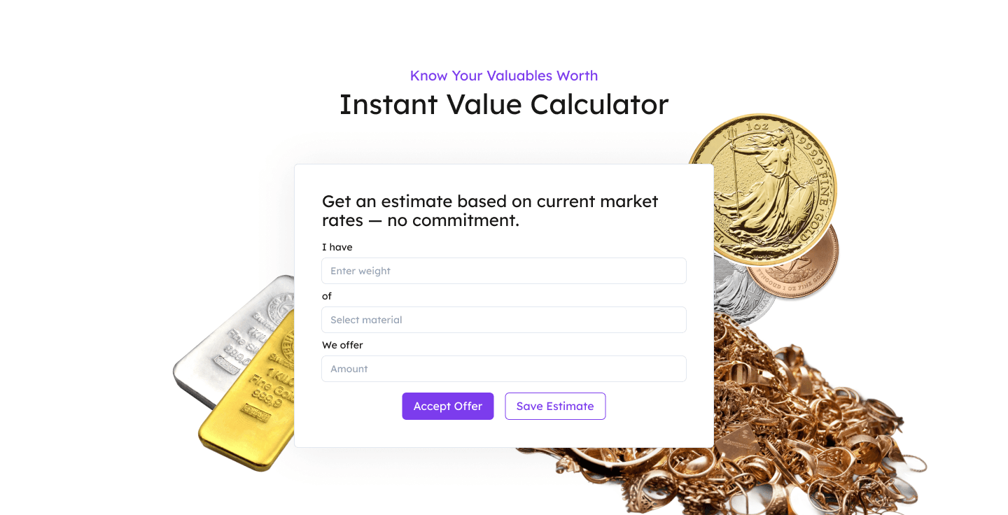
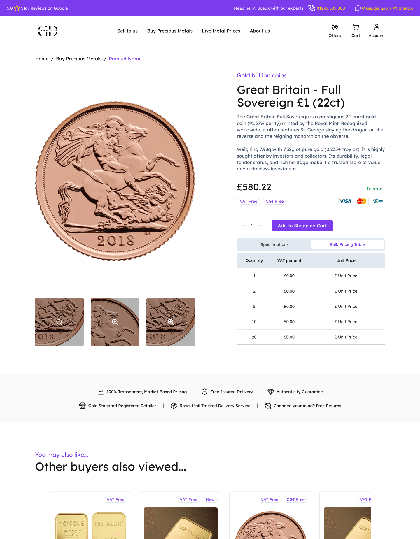
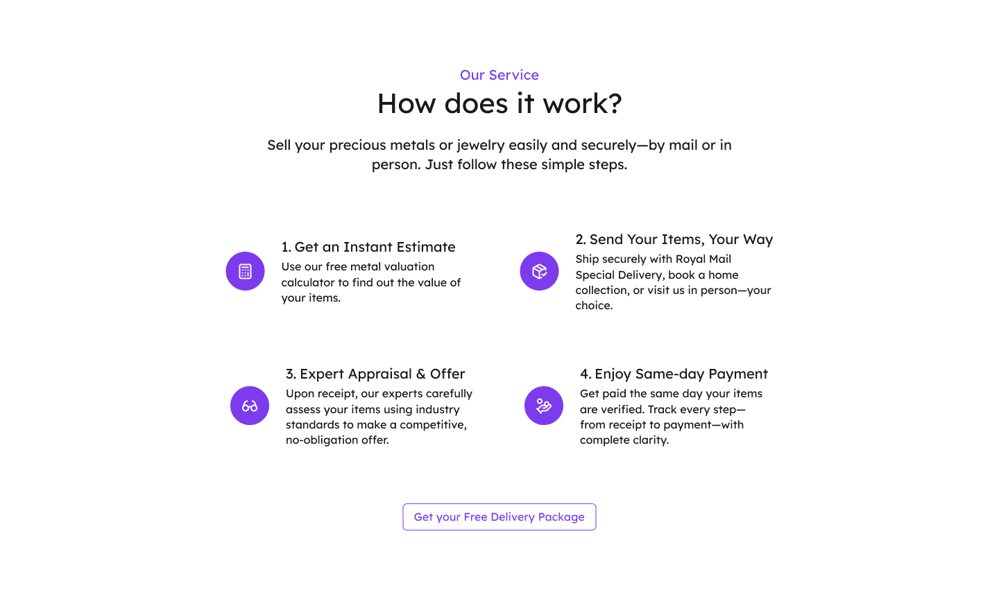
I restructured the site to prioritize critical user flows—showcasing the valuation calculator and trust-building messages on the homepage, simplifying the process with a 4-step visual guide in "How It Works," and embedding social proof throughout.
A cohesive style guide reinforced the approach - you can check the style guide here.
The final prototype balanced value (the calculator), clarity (streamlined steps), and credibility (testimonials, ratings) — all optimized for mobile and desktop. Stakeholders praised the navigation, tone, and aesthetic as both practical and trustworthy.
Iteration & Solutions
With a 15-day timeline and limited access to real users, I leveraged direct stakeholder feedback—grounded in years of in-store customer interactions and support insights—to guide design decisions.
The feedback loop included live walkthroughs, Slack discussions, and Notion documentation. This enabled me to review design decisions in the context of actual client pain points, frequently asked questions, and known user concerns.
Key Improvements Implemented:
Hero Section: Combined clear messaging, trust signals, and a strong CTA to immediately convey value
Calculator Engagement: Added a microinteraction that auto-scrolls users to the tool, reducing early drop-offs
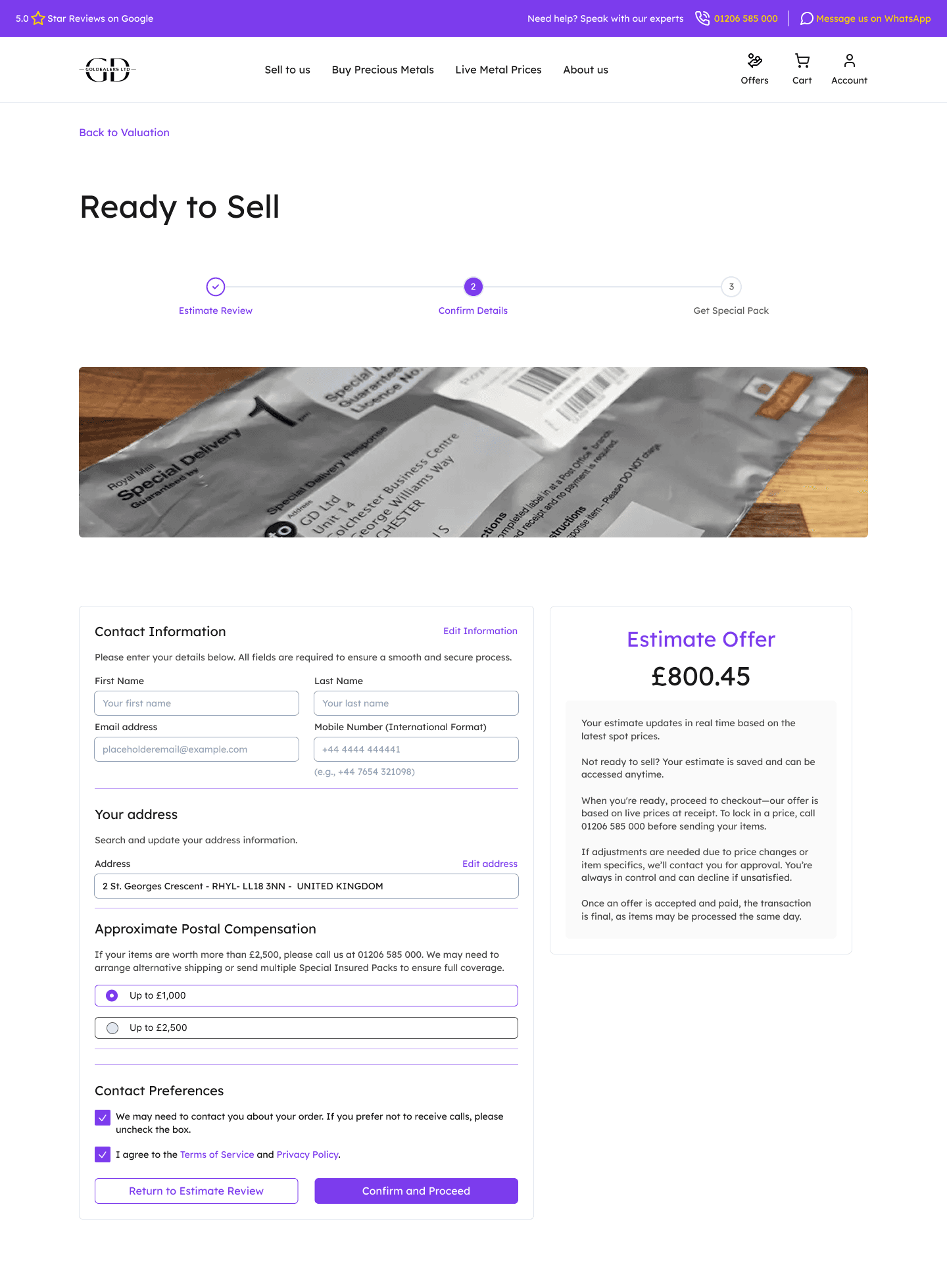
Purchase & Selling Flows: Redesigned for seamless progression with visual steppers, status indicators, and proactive reassurance at each step
Tone & Empathy: Softened language across the site to feel more approachable
Simplified Postal Flow: Replaced text-heavy steps with a visual 4-step guide for clarity
Account Creation: Eliminated premature requests, only prompting users when choosing to "Save Estimate" during calculator use
Hierarchy & CTAs: Optimized layout to guide scanning and reduce friction
Conclusion
Final Design Presentation
Note: As the redesign is currently being implemented, metrics are not yet available. However, stakeholder feedback has been consistently positive, and performance will be tracked post-launch to validate the design’s impact.
The research insights and the identified personas were essential in shaping the final solution. Each design decision was mapped back to real user concerns — from the emotionally hesitant first-time seller to the detail-oriented investor. The end result was a high-fidelity prototype that reflected the trust, clarity, and professionalism found in Goldealers’ physical store.
The project met all of the design goals: the calculator was made instantly accessible; account creation was reframed as a benefit, not a gate; the process was visually demystified; and trust signals were integrated throughout the experience. The stakeholders expressed strong satisfaction with the final outcome, appreciating how well it captured both the essence of the business and the needs of its customers.
Key Takeaways
This project taught me the importance of designing not just for usability, but for emotional clarity. Selling gold isn't just a transaction—it's a decision that carries personal history and emotional weight. By addressing user needs, simplifying flows, and building in reassurance at every step, I helped Goldealers transform their website into an extension of their trusted in-store experience.
This project reinforced that while every industry and business is unique, there are valuable universal lessons to be learned. In this case:
Clear, empathetic messaging outperforms aggressive CTA tactics
Users are more likely to return to the platform when they understand the process, not when they're forced to register
Design needs to guide emotionally, not just functionally
Thank you for reading!
I’d love to hear your thoughts and feedback!